BAM and the Em Dash

Yes, I know BAM and the Em Dash sounds like a great title for a film, but this post is going to take a break from Obscure Topics in Film Editing and focus on Obscure Topics in Typography.
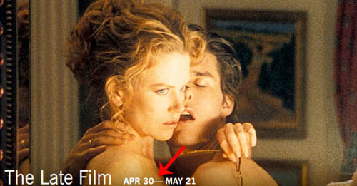
At least since I’ve lived in Brooklyn—and probably a lot longer—the Brooklyn Academy of Music has used an em dash (—) between dates rather than an en dash (–), which is the correct punctuation to use between dates. Every time I go there—or see one of their posters around the neighborhood—it drives me nuts. Three years ago I took the time to send a complaining e-mail to them. This was their response:
Hi Kyle,
Thanks for taking the time to study our ads in such detail.
We do intentionally use em-dashes even though we realize
that it is not technically grammatically correct.
The en dash is basically only used in ranges, so I guess they’re trying to drop it like an appendix. Apparently they think the em dash looks nicer, even though it clearly does not. It looks like a big ugly hunk of space that shouldn’t be there. Of course the bad kerning in the example above doesn’t help. Kudos to BAM for playing Eyes Wide Shut though!

The first sentence of their reply seems gratuitously ironic. There is no detailed study involved here — a passing glance is enough for anyone familiar with typographical conventions. Other than that, they are entitled to use incorrect and incongruous typography if they choose. They pay for the ads. I just think they should have been more polite in their response.